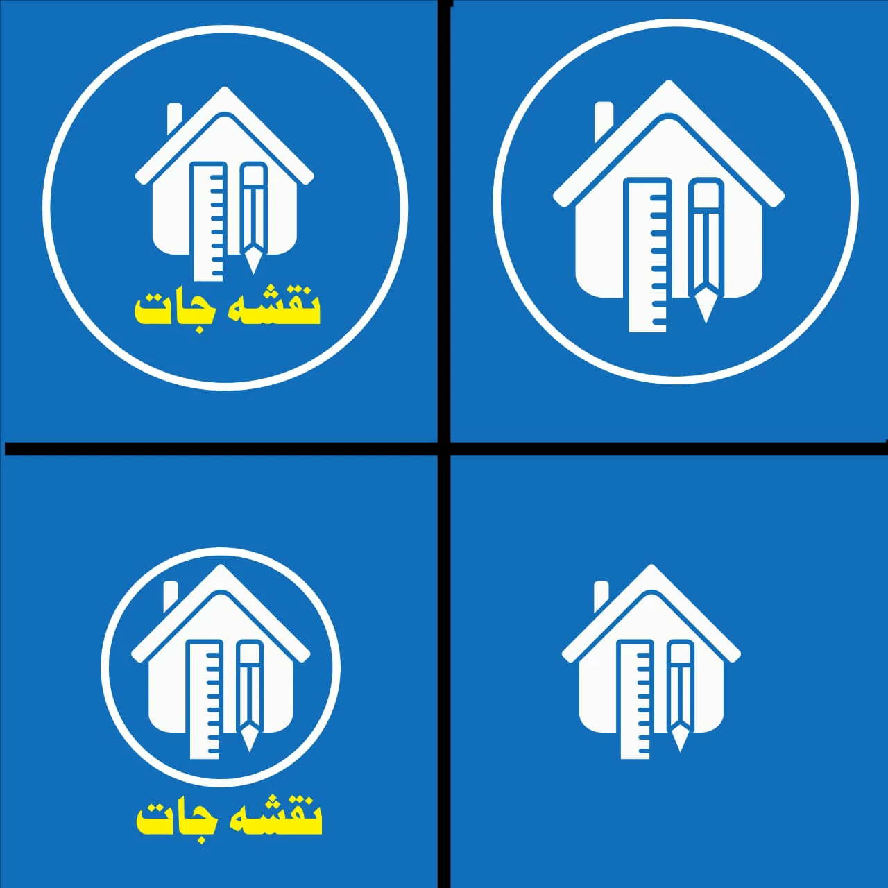
Client Objective
The client wanted a logo that worked like a watermark — simple, subtle, and instantly recognizable. No heavy detailing, no explanation, just a mark people could remember.
Design Constraints
- Extreme simplicity
- Must function at very small sizes
- Only three colors allowed: light blue, white, and yellow
The Challenge Moment
During the process, the design began to look visually strong — but it behaved more like a social media post than a logo. That pause became critical.
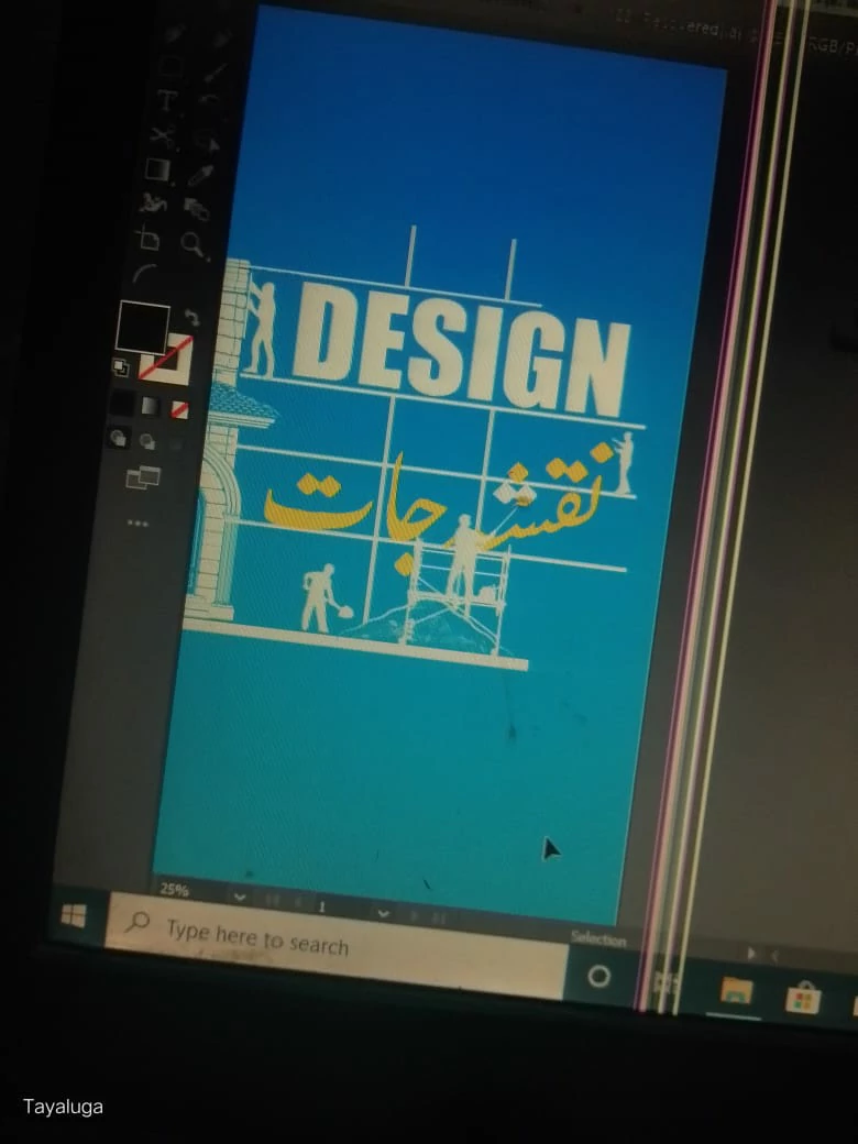
Reframing the Approach
The focus shifted from aesthetics to function. A logo must stand on its own, without captions, layouts, or surrounding context.
The Final Logo
The final mark embraced restraint. Built for recall, scalability, and quiet consistency — exactly what the client needed.
Professional Insight
Questioning whether something truly works as a logo is not a beginner mistake. It’s a sign of experience. Good branding often comes from removing, not adding.
Need a Logo That Works Everywhere?
Tayaluga designs brand identities with clarity, intent, and long-term use in mind. If you need a logo that people remember, not just admire — contact us.